I’ve always enjoyed translating content for high-end brands – even if most jewellery pieces and designer shoes are somewhat outside my budget at the moment. What makes them so enjoyable? I personally find that there’s so much fast food and fast fashion around, that it’s nice to be able to work with companies that care about quality and traditions.
When translating for jewellery brands, for example, I want to do justice to beautiful gemstones and intricate designs by providing beautifully crafted Russian translations and transcreations. These projects are creative and fulfilling, yet because of how the translation and localisation process for big brands is set up, issues often arise where they don’t need to.
Why do problems occur?
When working on website localisation projects, more often than not translators don’t get a chance to do a final check before or immediately after the translations go live. It is often up to the client and their technical team to implement the translation on their end. However, if the client doesn’t speak or read the language, they cannot spot misalignments or other errors.
Another issue that causes problems is that translators aren’t always given full context or guidelines on where on the website the text will appear, yet context is everything.
What happens when linguistic QA doesn’t happen?
I have looked at the Russian websites of some of the biggest jewellery brands and found several types of issues that can be resolved, making for a smoother user experience. NB: I decided not to name the brands because this isn’t about pointing a finger. I want to highlight how important it is to involve language professionals at every stage of the translation and localisation process.
1. Mistranslations and typos
The problem with mistranslations is that they confuse users and can also undermine their trust in the brand. Typos also spoil the first impression. Nobody wants that, right?
- Below is an example of a mistranslation: ‘location’ was translated as «локализация», where «страна доставки» or «местоположение» would have been more appropriate. Even in English ‘location’ and ‘localisation’ are not the same.

- On the same website there is another mistranslation of a crucial term – savoir-faire, which is translated in Russian as «экспертиза». A quick look in the dictionary reveals that it’s very far from the English concept of ‘expertise’. It’s more of a (forensic) test or investigation, so not the same thing.
- Another jewellery maison has a glaring typo right on their homepage! I have already brought this to their attention, but it’s been there for a few weeks at least! I decided not to include a screenshot and I hope it’ll be fixed soon.
2. Numerals & plurals
Russian numerals are generally tricky to master, and even trickier when it comes to localising them. Like Nataly Kelly points out in here article ‘27 web application localization best practices‘, plurals need to be handled with care. In Russian, for example, different sets of rules exist for different sets of numbers (1, 21, 31, etc. is one set; 2-4, 22, 32, etc. is another; 5-20 etc. is yet another).
This is why translating search results isn’t easy: whether the search found 36 or 51 models, the word “models” in English doesn’t change. In Russian numbers will need to be followed by 3 different variations of the same word – “модель”, “модели”, “моделей”.
Usually it’s better to change the structure to: «Модели: 36» or «Всего моделей: 36» or «Найдено моделей: 36».

The same issue plagues the Russian website of another big jewellery brand. Unfortunately, in Russian it’s not enough to just stick one plural after the number and hope for the best. What you end up with is a grammatical mistake.
3. Font and layout issues
Brand names are always kept in English or French, which is how it should be, but sometimes the Cyrillic variation of the same font looks very different and it creates a bit of a visual discrepancy.
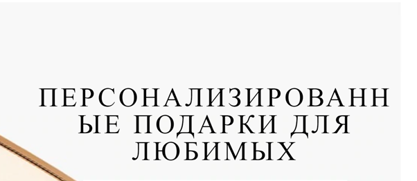
Due to word growth sometimes word end up being split where they shouldn’t be. This can often occur in Russian as the words tend to be much longer, so it’s essential to have the final images checked by the translator or QA linguist.

4. Tone of voice
Some brands use an overly formal way of addressing customers – «Вы», written with a capital letter. While many of the high-end brands favour this version for fear of their customers taking offence, this is becoming less and less common and is no longer good practice. I’ve written a blog post earlier about the tone of voice and various forms of addressing Russian customers.
5. Repetitive CTAs
Call to action buttons are incredibly important to entice customers to learn more, yet too often the same text on the CTA buttons is repeated over and over again – ‘Read more’, ‘Explore’, ‘More details’. This can be a bit… uninspiring.
However, I discovered that Van Cleef & Arpels handle this beautifully on their websites, both English and Russian: CTAs are specific for each collections and give an idea of the collection’s theme, for example, ‘Let the flowers shine’ or ‘Capture the gentle light of the moon’.
How to avoid and resolve linguistic issues?
Big brands tend to hire translation agencies for website localisation projects, who then hire freelance translators. As a result there’s a lot of back and forth when it comes to asking questions, checking context and implementing the changes. With so many steps and so many people involved, it is not surprising that many things fall through the cracks. Most of the issues listed above can, however, be prevented or resolved through a linguistic QA before the translated web copy goes live.
Would you like to benefit from a linguistic QA for your website to make sure your Russian copy and interface are impeccable? Please get in touch via contact form or email me at yulia@choiceofwords.co.uk and I’d be happy to discuss your requirements.


